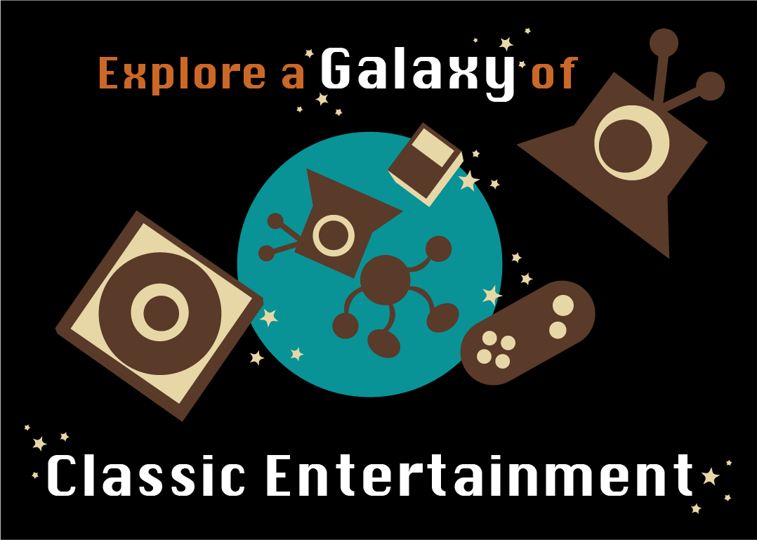
Revisit the past by renting your favorite old movies, shows, music albums, video games, and so much more! Rent a room to play games, sing karaoke, or watch movies with friends and family.
Travel through time and remember the good ol’ days with NostalgiAV.
Go to your local NostalgiAV store or visit our website at www.nostalgiav.com


Hi Megan, I really like your advertisement. The concept is fun and interesting, and the graphics pull everything together really nicely. After viewing your advertisement, I want to know more about NostalgiAV, which is great because I think that is what a good advertisement should do. Your ad is incredibly charming, which adds to the nostalgic appeal you are going for with this advertisement. The concept is really fun and creative. I see a lot of appeal in renting a room to engage in various nostalgic activities. At first, I thought the advertisement would be about a television channel that hosts nostalgic shows. I assumed this based on the initial graphics. As I delved deeper into the ad, I realized that NostalgiAV is about all-encompassing nostalgia. I’m extremely curious about the room set-up. Are the rooms themed? If the room has a theme, will it employ a generalized nostalgic feeling, or will it be more specific?
Your themes of galaxies and time travel suit the product of nostalgia-based media well. I like the slogan, “Travel through time and remember the good ol’ days with NostalgiAV.” The character with a television head makes a great mascot for the franchise; he already feels iconic. Overall, I really enjoy the concept, but I would like to know more.
Hello Megan, I really like your advertisement! It looks very professional, and I also like the graphics you implemented into the ad. Showing the different types of art illustrations also shows the viewer the various kinds of activities your store can host. The color pallet matches the nostalgics the company promotes with its warm-toned graphics and retro style for the electronics. The blue circle in the very back is also a great way to catch the viewer’s attention when they are passing by in a hurry. It makes them take a moment to view the graphics and then the words themselves. The font’s color is also another great choice, as the bright white and slightly larger words “Galaxy” and “Classic Entertainment” are eye-catching above the black background. The orange color of the wording “Explore a” and “of” are also great choices for incorporating the color pallets together in a cohesive style. The font choice itself is another good way to combine retro and nostalgia. This is because that type of font could be associated with the popular type of font that arcade machines and advertisements had back when they were more popular. Great work on this and have a good day!
Hi Megan! I’ll never get over how adorable and clever your ad’s mascot is. That’s not even to mention the colors. I’m personally a sucker for this kind of color palette, with the majority of warm tones with such a striking color from a cool-toned pallet, and it’s just the best. The tagline is also so cute and definitely eye-catching. I could see this being appealing to anyone from any age demographic, especially with how cute the mascot is and the general idea of the store! 10/10 big fan.